Should you do an accent wall?
Should you do an accent wall?
One of the most common questions we get asked during our design consults at Seriously Happy Homes is whether someone should do an accent wall. Well, it’s not a cut-and-dry answer… there are quite a few things to consider when deciding if you should have an accent wall!
Before committing to an accent or feature wall, you should ask:
- How will the accent wall change the proportions of my room? Will it make it feel more proportional, or weirdly long/skinny/short/tall? Some rooms want to be all one color – others benefit from a feature wall!
- What will the accent wall draw my eye towards? Will it draw attention to (or create) a focal point? Will it help draw attention *away* from something unsightly? Basically: what is the purpose or “point” of the accent wall?
- Will the accent wall help create flow between rooms, or maybe help set off one area from another?
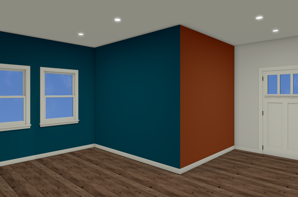
In *this* post we’ll look specifically at how to handle a bump out area (ie, a corner that juts out into a room like in the images below), and at how your accent wall choices affect the feel of the space. We’ll use complimentary colors (in this case, orange and blue) to highlight the effects of each combination.
When you have two walls that come together like this, coming forward into your room, you have three corners to choose from when deciding where your accent color stops and starts:
So where should the accent start and stop?
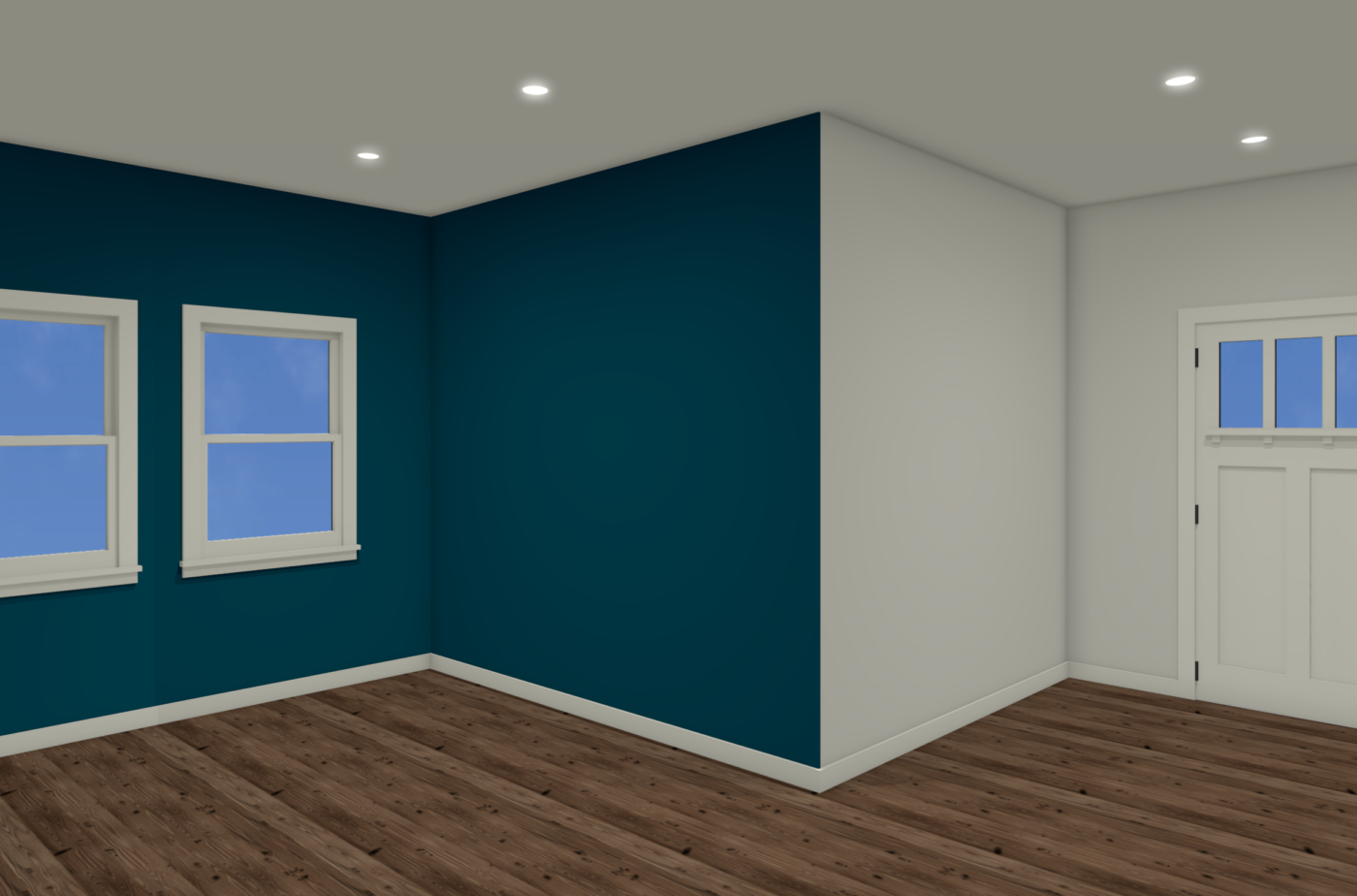
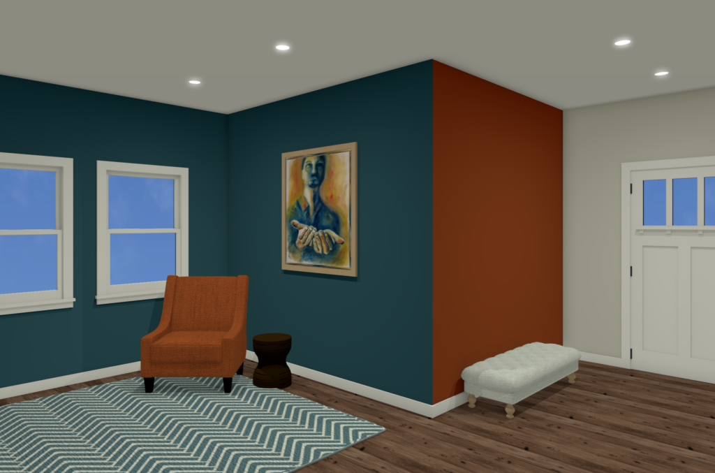
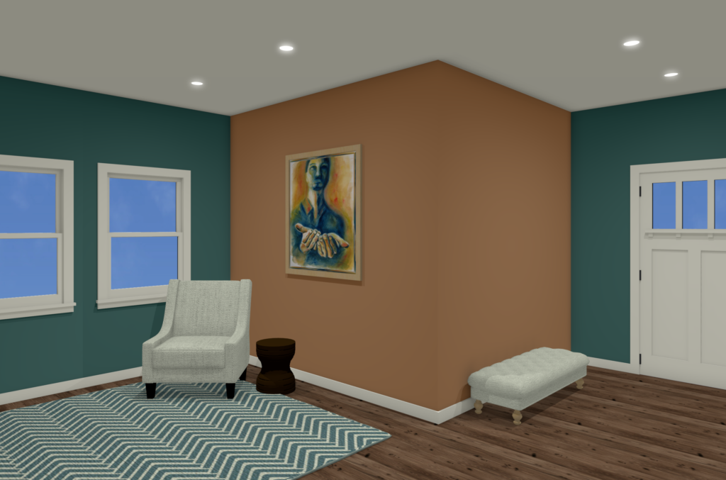
Like we said, there’s no one right answer. Sometimes we use feature colors to create separation between two “rooms.” In the image below, keeping the blue to the window and side walls creates cozy separation between the living room area and the entry area:
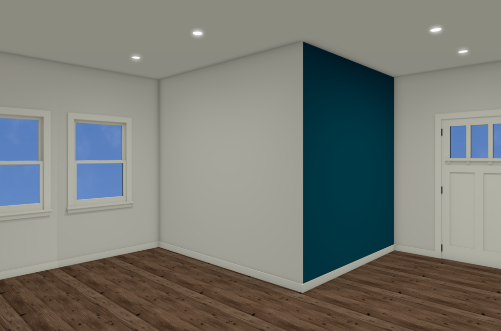
Alternatively, we could do a single feature wall to set off the entry, keeping the living room area light and bright while developing that same separation between spaces:
If you’re going for a more colorful effect, then you may be considering one feature color for the entry, and another for the living room, but that can make a space feel crowded or busy without using some careful decorating and design techniques to balance out the rooms:
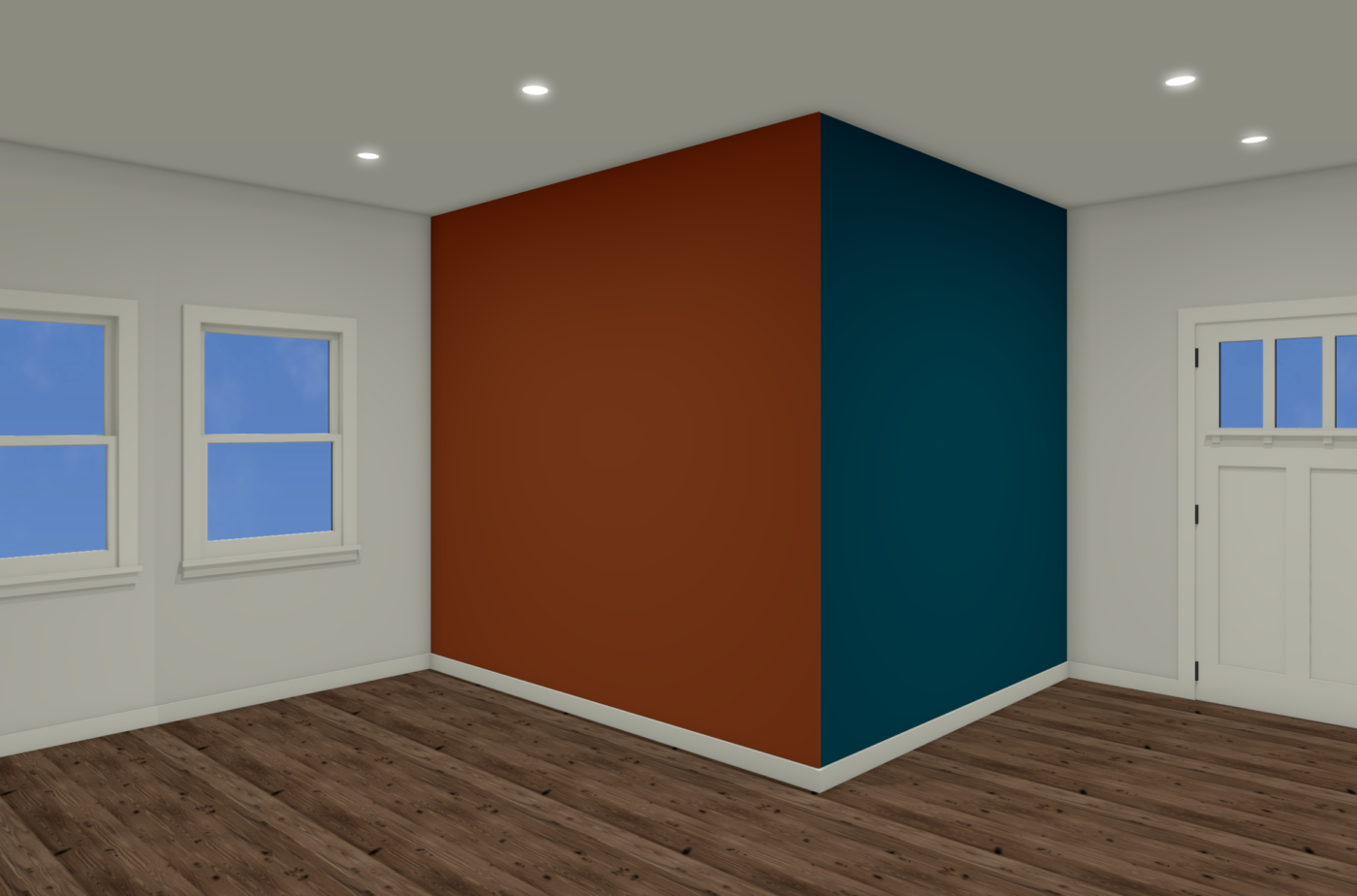
By doing this we’ve actually created *two* accent walls in the above example, and they can easily start to compete with each other! (Note, this kind of paint color decision will almost always look “weird” in an unfurnished room, and only makes sense in the context of a larger design.)
In fact, there are a LOT of competing things happening in the above image:
- We’ve split the forward corner of that bump-in wall. That 50/50 split means that neither orange nor blue is “dominant” or “leading” color – they’re competing with each other. 🫤
- We have a *very* energetic color combination (because the orange and blue are opposite each other on the color wheel). Complimentary color palettes are *great* but they have to be done carefully in order to avoid being overwhelming!
- These are BOLD colors! Obviously, softening the colors would have a tremendous effect on the final look and feel of the room!
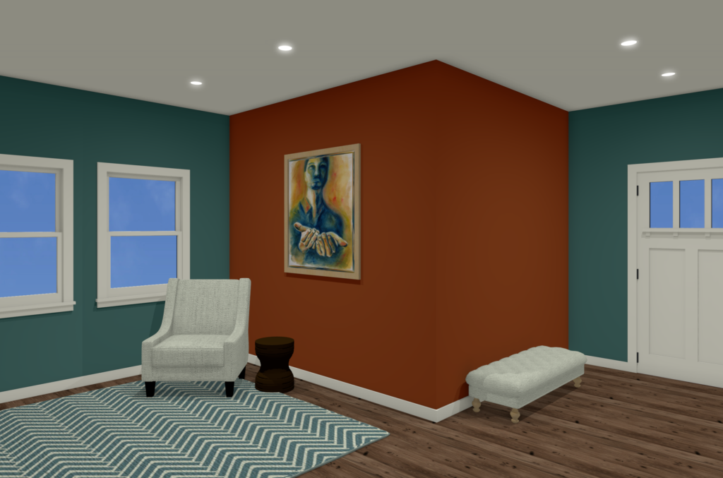
First let’s address that 50/50 split. Sometimes, just adding *more* of one of the colors can help make the choices feel more intentional, like:
Now blue is the dominant accent color, and the orange is the *secondary* accent color.
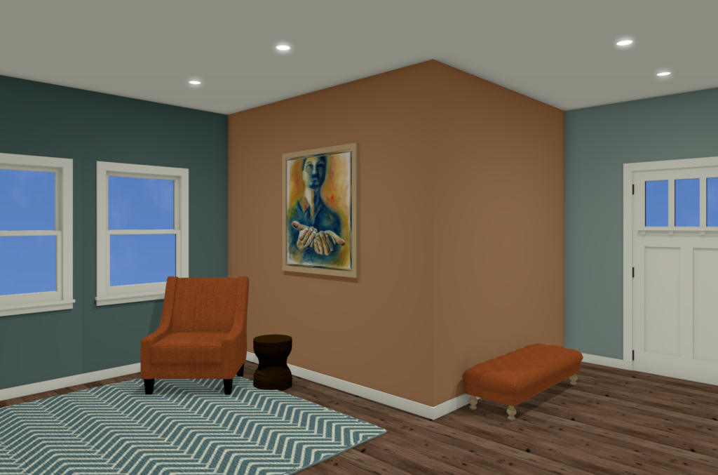
The next step is to increase cohesion and flow from one space to the next by “cross-pollinating” 🐝 the accent colors from one area to the next using furnishings, art, and accessories:
Just bringing an orange chair plus art with a dash of orange in it ties the two spaces together, making them feel “on purpose.”
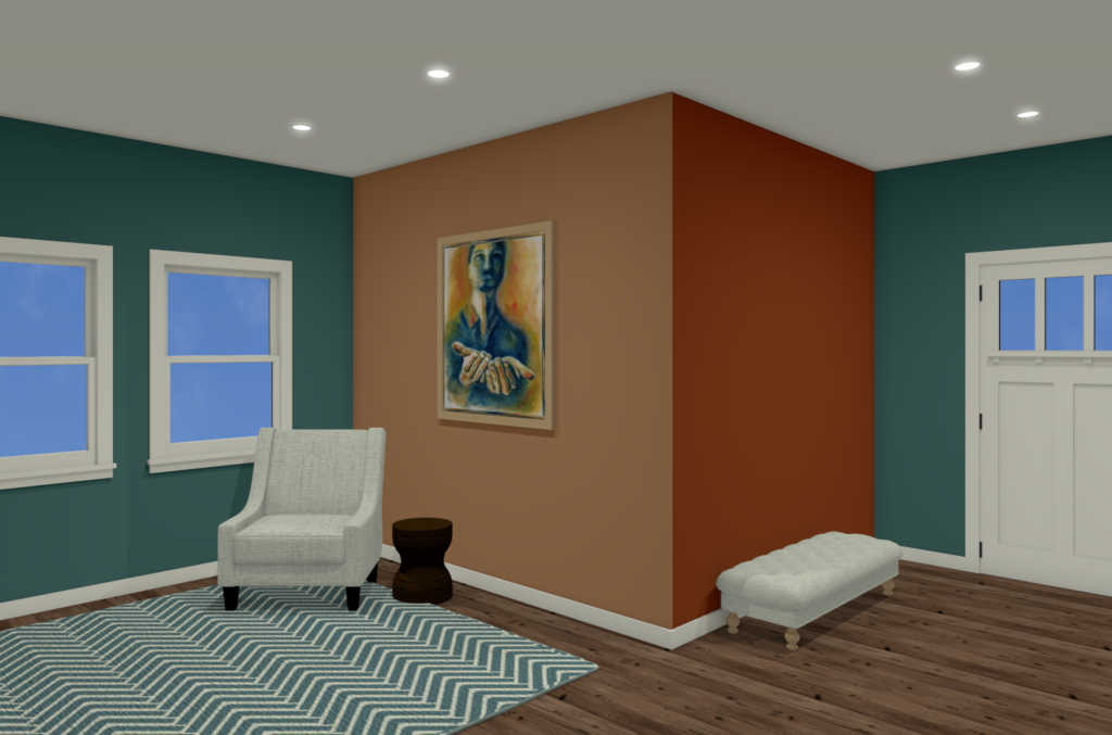
If that’s still too dynamic, but you want those bold colors, consider making that bump-out wall all one color, instead of splitting that forward corner:
It’s still bold and colorful, but feels a bit calmer because the big, boxy, square bump-in is one anchored unit instead of being split in two. Notice that the chair is now a neutral color, softening the effect of the deep colors.
You can also make the bump-in wall two different colors, but choose colors that are “analogous” (ie, from the same section of the color wheel). That unifies the bump-in wall just like when it was all dark orange, but mixing it up could let you go softer in one area (like the living room below), and bolder in another (like the entry below):
If that feels like too much color, consider softer versions of the same color family. Some of our clients worry that softer, dustier colors look boring 😳 but as long they’re paired with a rich version of the complimentary color, the combo will still feel rich and dynamic. Here we toned down the fire-orange to a soft pumpkin orange. Can you see how, since the colors are opposite each other on the color wheel, they still have plenty of energy? It’s just not as “loud.” 😀
If that feels too soft, then start layering the bolder orange back in through accents and furnishings, like below. You may notice that we not only softened the orange on the bump-in wall, but also the blue color on the wall by the door. That’s because once I added in the bolder orange chair and bench, something else needed to be a little less intense. Remember, every ingredient affects the next ingredient!
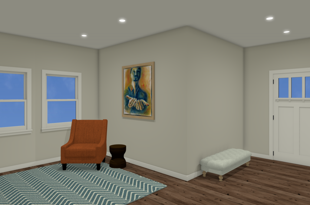
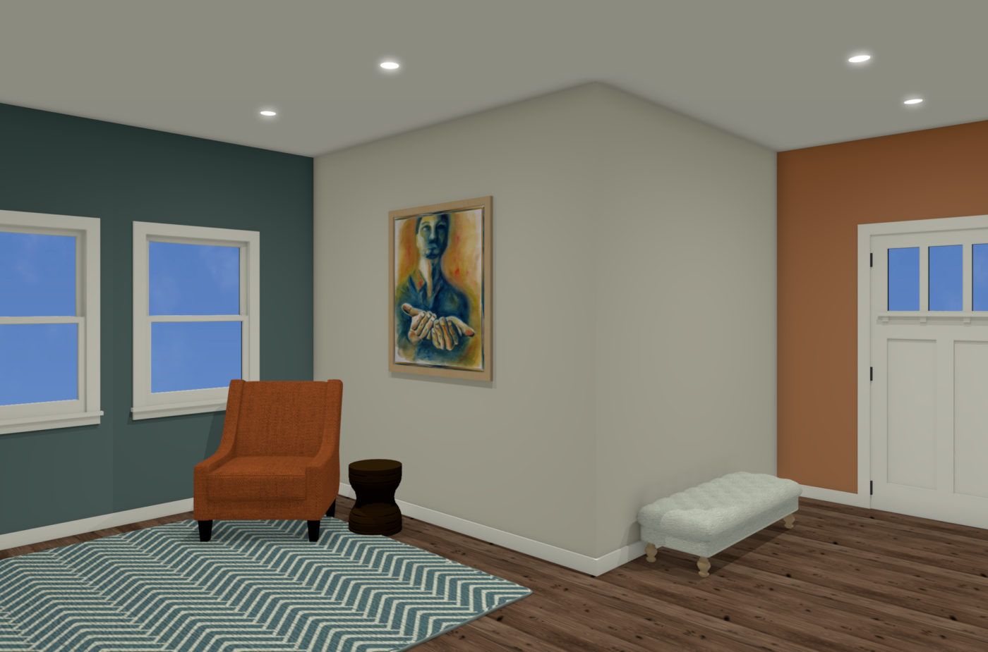
Last but not least, remember that including some white space can give the eye a place to rest, softening the impact of the bolder colors and making the space more livable for most folks (and less like a “sports bar” or “kid’s room”). In the example below we left the bump-in wall neutral, used blue to define the living area and orange to define the entry, then brought bold orange into the living room with the chair and art to keep it vibrant and to tie the two spaces together:
As you can see, the combinations are endless! 😳
If you’re overwhelmed, ask yourself the following questions:
- What am I trying to *do* with these accent colors? Create a focal point? Draw attention to or away-from something? Add warmth? Add energy? Re-proportion a long skinny room?
- What overall *feeling* am I trying to create? Soft and calm? Bold and dynamic? Playful and fun?
- How do I want my rooms to relate to each other? What dominant feeling do I want in the whole house? Which rooms should feel calmer? Which rooms should feel more energetic?
Hopefully asking these questions will help you make decisions about your accent colors but, even if you have to call in a pro, knowing the answers to these questions will help your designer or color consultant help you find the right colors for you. And *that* is the key to creating YOUR happy place! 😊
Hope that helps!! And if you do need to call on a pro, we’d love to help; schedule a Design Helpline to chat with us over Zoom! We’re here if you need us!
May your home always make you Seriously Happy!

More Advice for your Seriously Happy Home


Eager to get happy at home right now?
Get 10 tips for a happier home!

HI, I'M REBECCA WEST! I’m the founder of Seriously Happy Homes, the author of Happy Starts at Home, and a business coach for residential interior designers.
I believe our homes have a huge impact on our happiness and well-being, but I don’t care if you buy a new sofa or remodel your kitchen. I just care that your home supports your goals and feels like “you.”
May your home always make you happy! 