Color Psychology… really??
Color Psychology… really??
During QA Sessions we get asked a lot of questions like “should I paint my room yellow?” The word “should” is always a big flashing red light to which I respond… maybe.
The thing is, when someone asks me if they “should” do something to their home they are often responding to something they saw on HGTV, or something their sister/neighbor/mother-in-law said to them.
The only thing I can do when asked that kind of question is put on my sleuth hat and ask a bunch of questions: “What do you want this room to feel like?” “How do you feel about yellow?” “Do you want this room to be more cozy and warm, or more light and airy?” “Is anything else changing in this room that might affect my answer?”
Often if someone asks me if they should paint their room yellow, they are really asking – what can I paint this room to make it brighter/warmer/friendlier/happier?
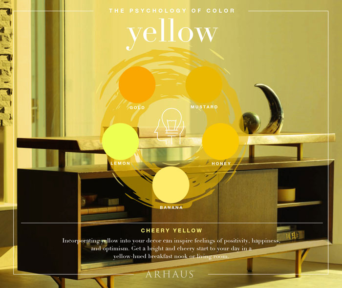
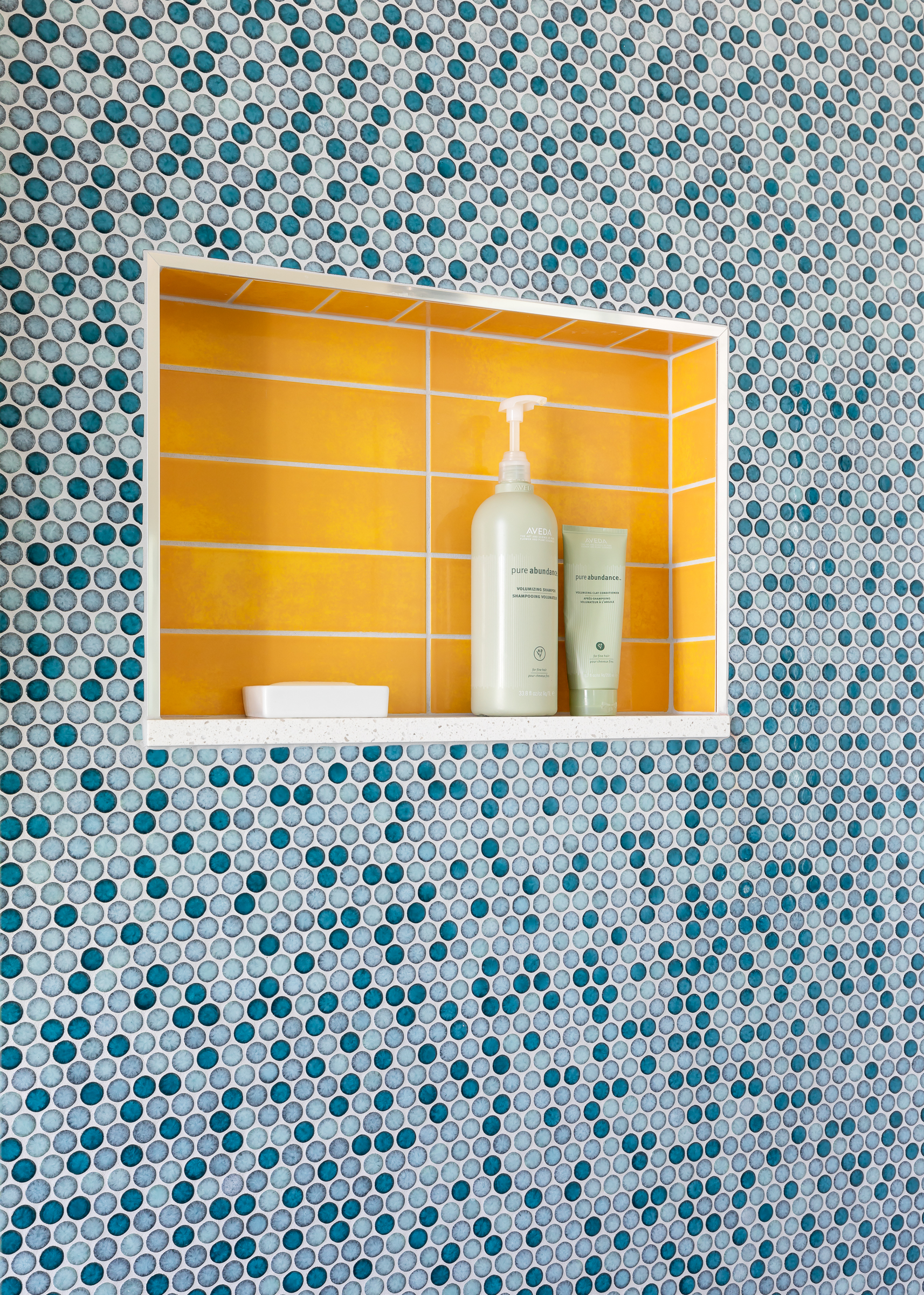
According to color psychology *yellow* would be a great answer since, all things being equal, humans usually feel more optimistic, positive, and happy when they see the color yellow. But seeing a bright yellow daffodil is quite different to waking up to a bright yellow room, and if the lockers in the gym where you got beat up in 3rd grade were yellow, that color may not be your favorite association.
I can tell you all day that yellow is great color for your kitchen, BUT if you hate it, you hate it. End of story.
That’s not to say that color psychology isn’t real. It is. For example, humans have a physiological response to the color red, with a measurable rise in blood pressure and heart rate when they see it. Maybe it’s innate, or maybe it’s the association with scary things (blood and stop lights and sirens) that creates that response. If daffodils and sunshine were red, and blood and sirens were yellow, it’s likely that our responses and associations would flip.
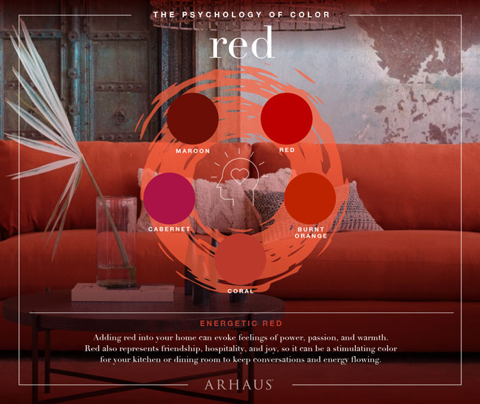
The power in color comes from association. We think of red as powerful and sensual because so many things that are powerful and sensual are red. We think of yellow as bright and sunny because (duh) – the sun. We associate green with growth and success because plants – and, in the US – money, are green.
So, if color psychology is real, but associations are not set in stone, how do you put this to work for you? 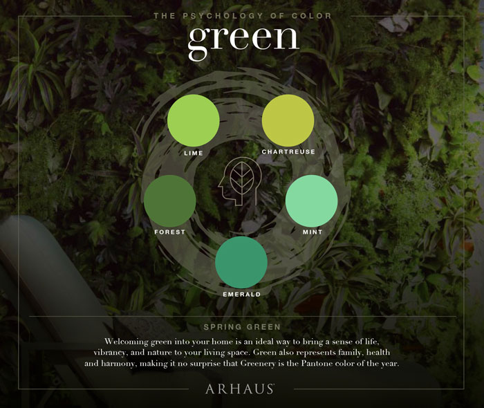
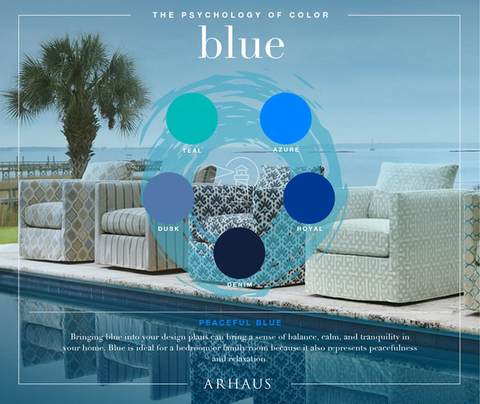
Instead of trying to use it as a formula, understand what is *behind* color psychology. Our associations form our responses to color, and those responses shape how we feel in a certain space. If we associate the color blue with the beach, a clear sky, or the ever-present ocean, then using it on our bedroom walls *can* evoke a feeling of peace, and using it in marketing (think of every bank and every insurance company, ever) can instill a sense of trust, calm, and permanence. So use color psychology to your advantage, and try to pay attention to when others may be using it to influence you.
Most importantly, don’t bother fighting your associations. If you hate yellow, you hate yellow. There are plenty of other colors in the rainbow to choose from.
May your home always be happy!

More Advice for your Seriously Happy Home

Eager to get happy at home right now?
Get 10 tips for a happier home!

HI, I'M REBECCA WEST! I’m the founder of Seriously Happy Homes, the author of Happy Starts at Home, and a business coach for residential interior designers.
I believe our homes have a huge impact on our happiness and well-being, but I don’t care if you buy a new sofa or remodel your kitchen. I just care that your home supports your goals and feels like “you.”
May your home always make you happy! 