Creating A Colorful, Happy Home
Oh my gosh you guys! This before & after story is full of the most wonderful splashes of color and pattern, resulting in SUCH a delightful, happy home! But while I LOVE all the color that our designer Rachel infused into the whole design, my favorite part is how grown-up and sophisticated it feels – a key measure of success for the now-very-happy homeowners!
Before we dive into telling our story of this delightful home, let’s let the clients speak for themselves:
“For the last 20 years, whenever we’ve needed to decorate or buy furniture, we’ve looked at catalogs for stores we like – IKEA, West Elm, Crate & Barrel – and then tried to mimic the design of the rooms we liked. Knowing that it was time to replace some old furniture in several rooms in the house, we wondered “What would it be like to have a designer help us achieve a fresh and more coordinated look?” That way, we’d get the new furniture we were already planning to buy, but the whole look would be more than the sum of the parts.
Well, we are overjoyed with how the design turned out! Turns out, we never really knew our design style before because we were always mimicking a pretty mainstream, neutral design from catalogus. Now the house feels as fresh and original as we are. 😀 Walking in from a grey Seattle day and seeing the bright, bold colors throughout the house fills us with joy every time. The whole transformation has been exhilarating and life affirming in ways we did not expect, and we couldn’t be happier with the results!”
Aww! 😊 Well, that makes *us* Seriously Happy!! Now let’s see what *you* think!
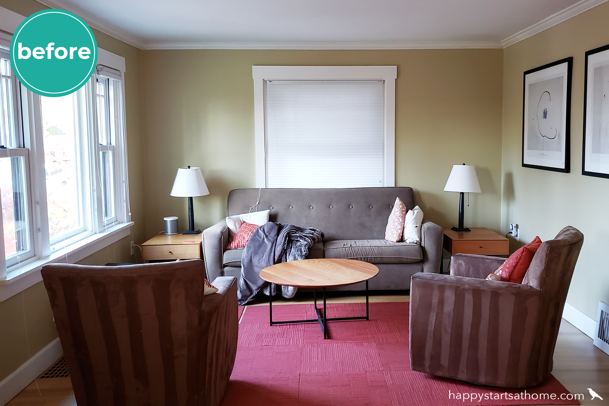
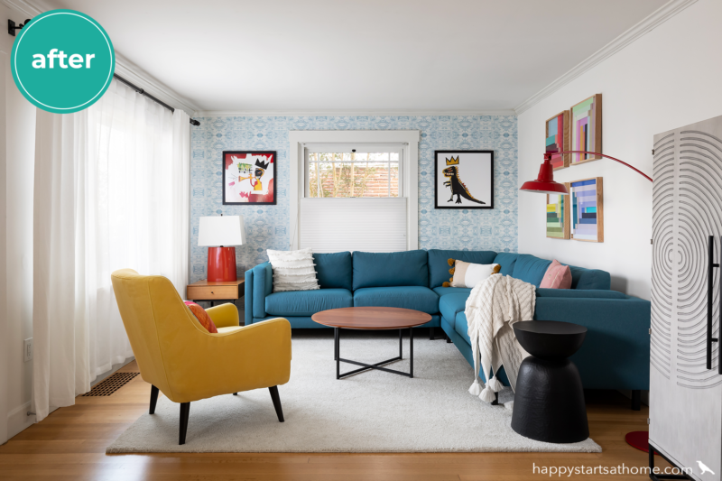
First up: a Lovely Living Room.
Before, the walls were a rich warm yellow and the rug added a splash of red, but despite all the color, the clients felt like it was bland and boring… not the way they wanted to welcome guests into their home. 😕
Once it was complete, no one could call this room boring! The fresh white walls, curtains, and area rug create a bright and airy backdrop for the personality-filled teal sofa, mustard yellow chair, wagon red lamp, and colorful modern art, while the pale blue patterned wallpaper from Anthropologie keeps it from feeling sterile or stark. Note that we were able to keep the existing Room & Board coffee table and one of the side tables – don’t they look right at home in the new room?!
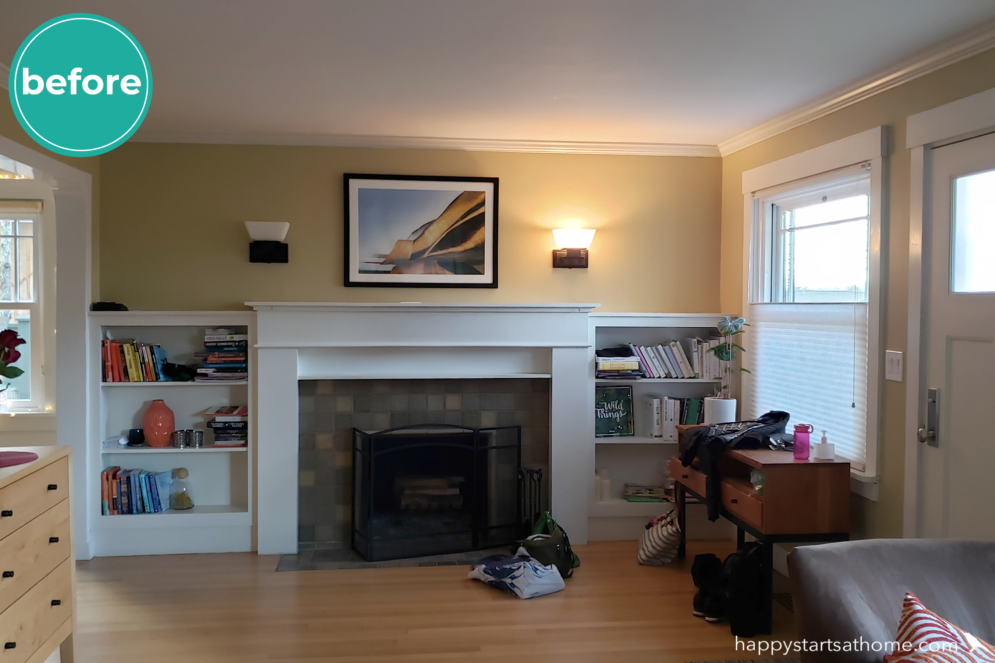
On the other side of the room the fireplace was the focal point of the entry, but felt earthy and anchored instead of crisp, fun, and Fab like the client wanted. We just *had* to add some flair!
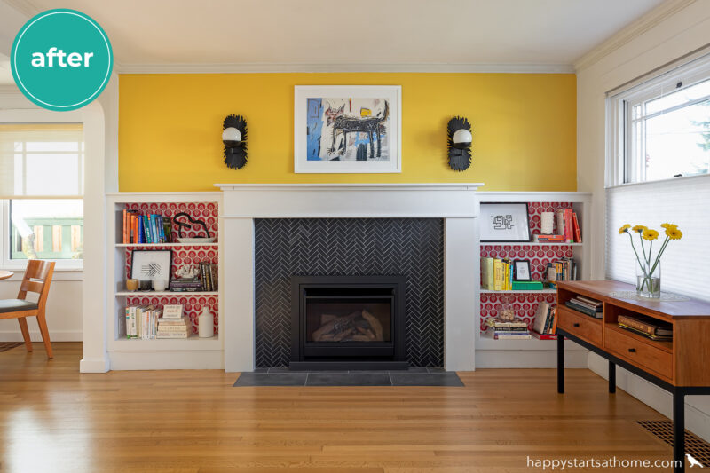
So, “add flair” we did! Check out that splash of sunny yellow wall paint (which ties into the yellow chair across the room), the crisp black herringbone tile, and that delightful red patterned wallpaper from Spoonflower in the back of the bookshelves! We topped it all off with textural starburst sconce lights flanking a Basquiat art print over the fireplace. In the wrong hands this all could have been too much, but we think it turned out just perfectly!
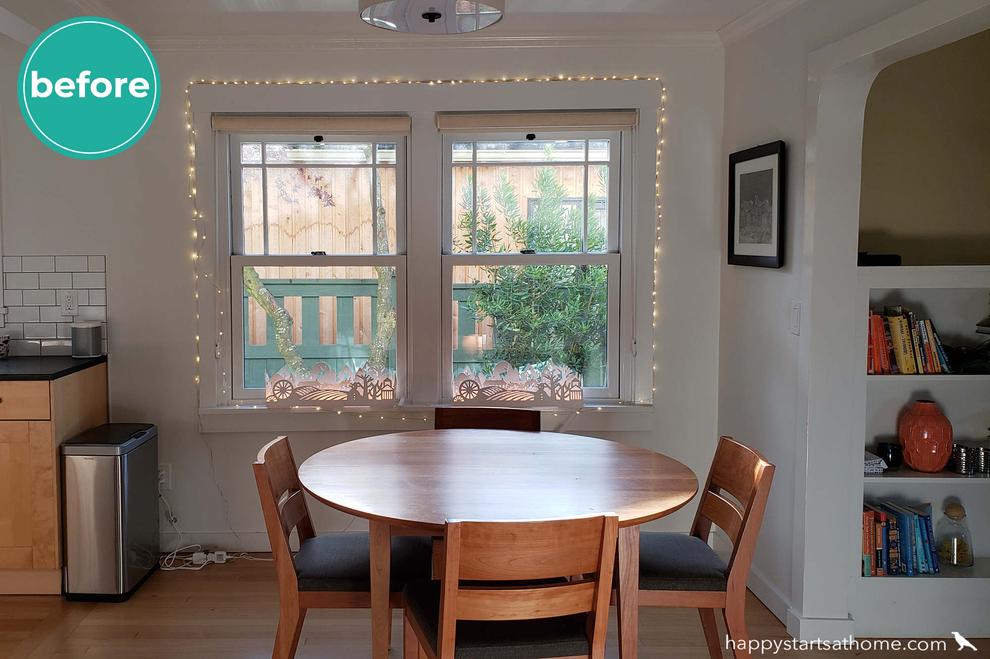
Delightful Dining
Next door in the dining room we had another blank canvas to work with. The clients loved their dining table and chairs, but the rest of the space was missing personality:
Building off the bold yellow wall over the fireplace we suggested they hang a playful yellow pendant light over the table and pair it with a modern art print featuring the same sunny yellow. Subtly patterned geometric wallpaper adds a textural backdrop, and a delightful multi-colored mobile puts the cherry on top in the corner over the bar cart.
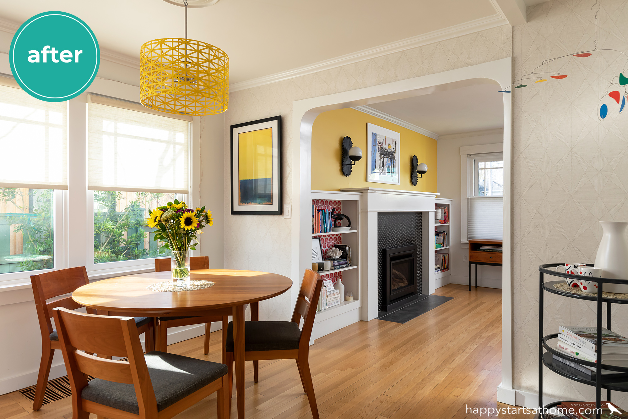
Designer tip #1: if you want to add a bold accent color to a room, try to repeat that color at least three times – that way it looks intentional, rather than random.
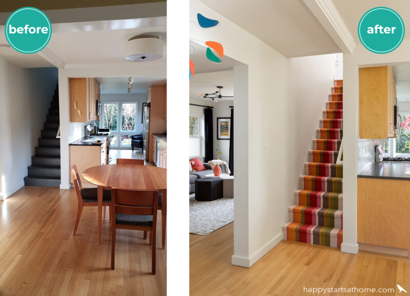
Bold Stairs
From the dining area you can see into the rest of the main floor of the house – down the kitchen to the reading nook, up the stairs to the bedrooms, and off to the side in the family room. With the stairs front-and-center we took the opportunity to use what our clients affectionally branded “Seriously Happy” carpeting as the runner rug! It took Rachel some sleuthing to hunt down this rug (it came all the way from the UK!), but it adds such JOY to the stairs! 🌈
A Cozy Reading Nook
At the end of the kitchen our client had a special corner for enjoying her morning coffee. Just a few small changes (a new chair and a terrific teal runner rug by Flor) elevated this little nook, and now it’s an even *more* lovely spot to enjoy that cuppa-joe!
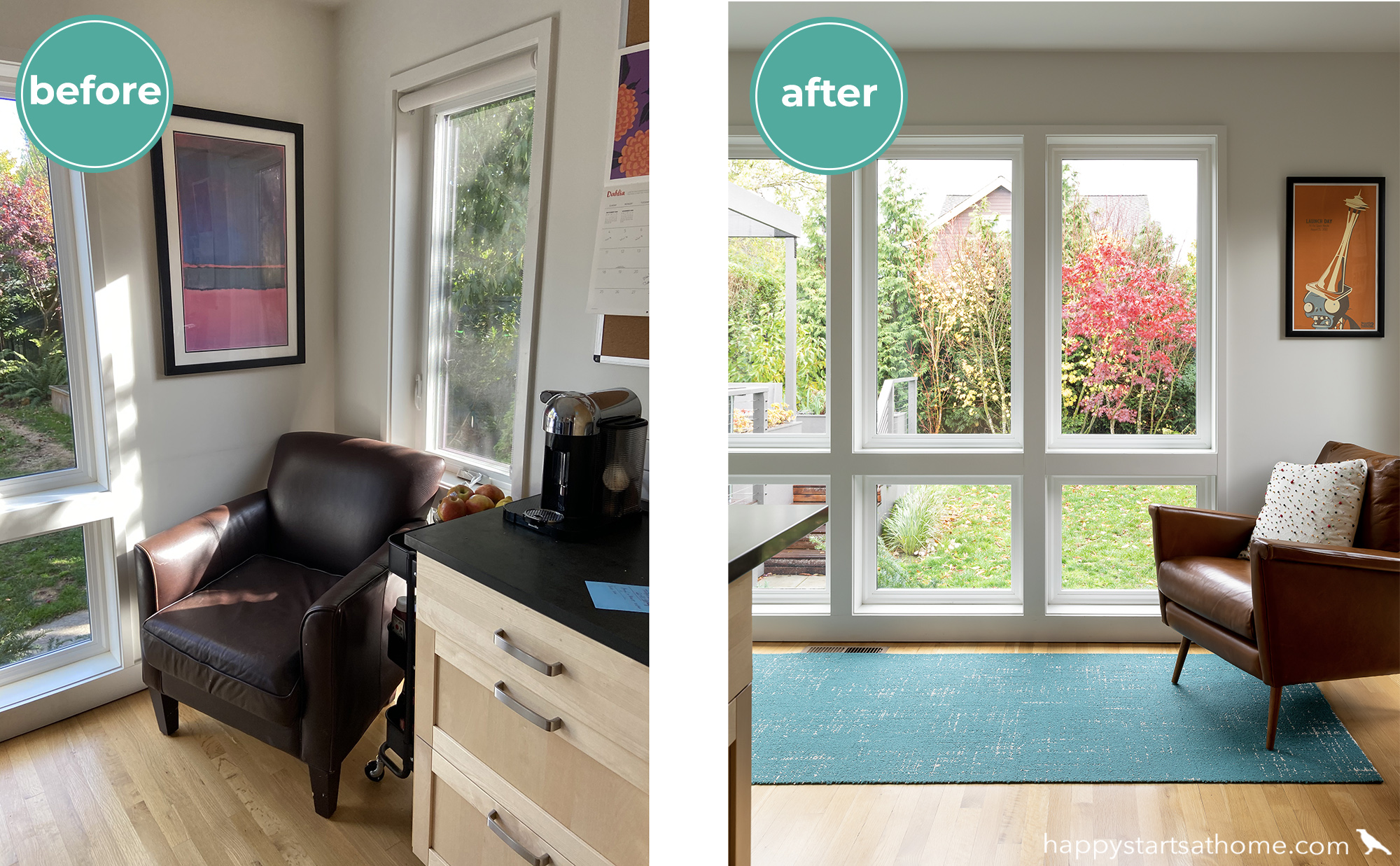
Designer Tip #2: Notice how the teal color of the runner compliments the orange color of the flooring, leather chair, and the art – using a complimentary color scheme (in this case blue and orange) makes both colors look richer!
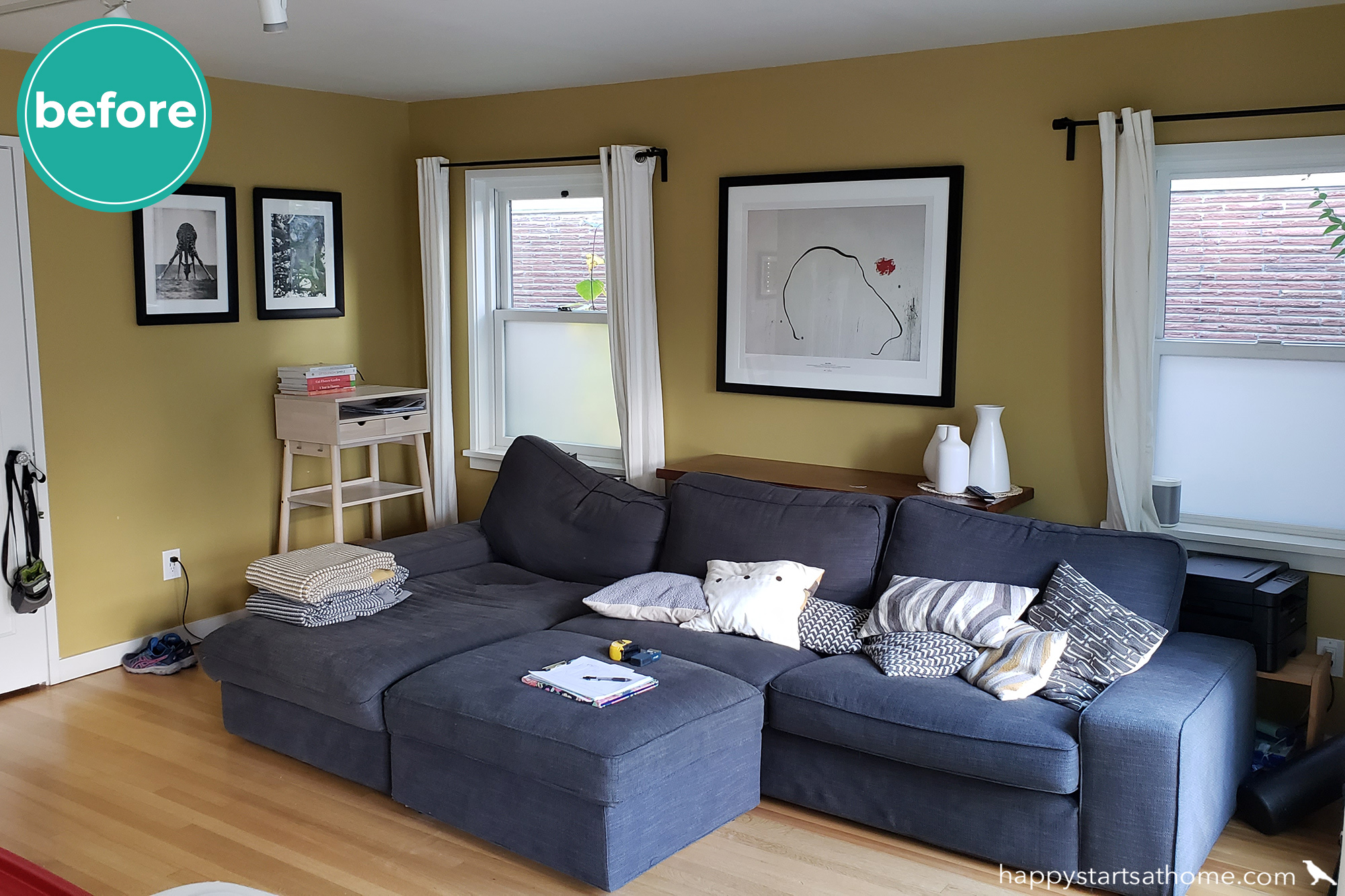
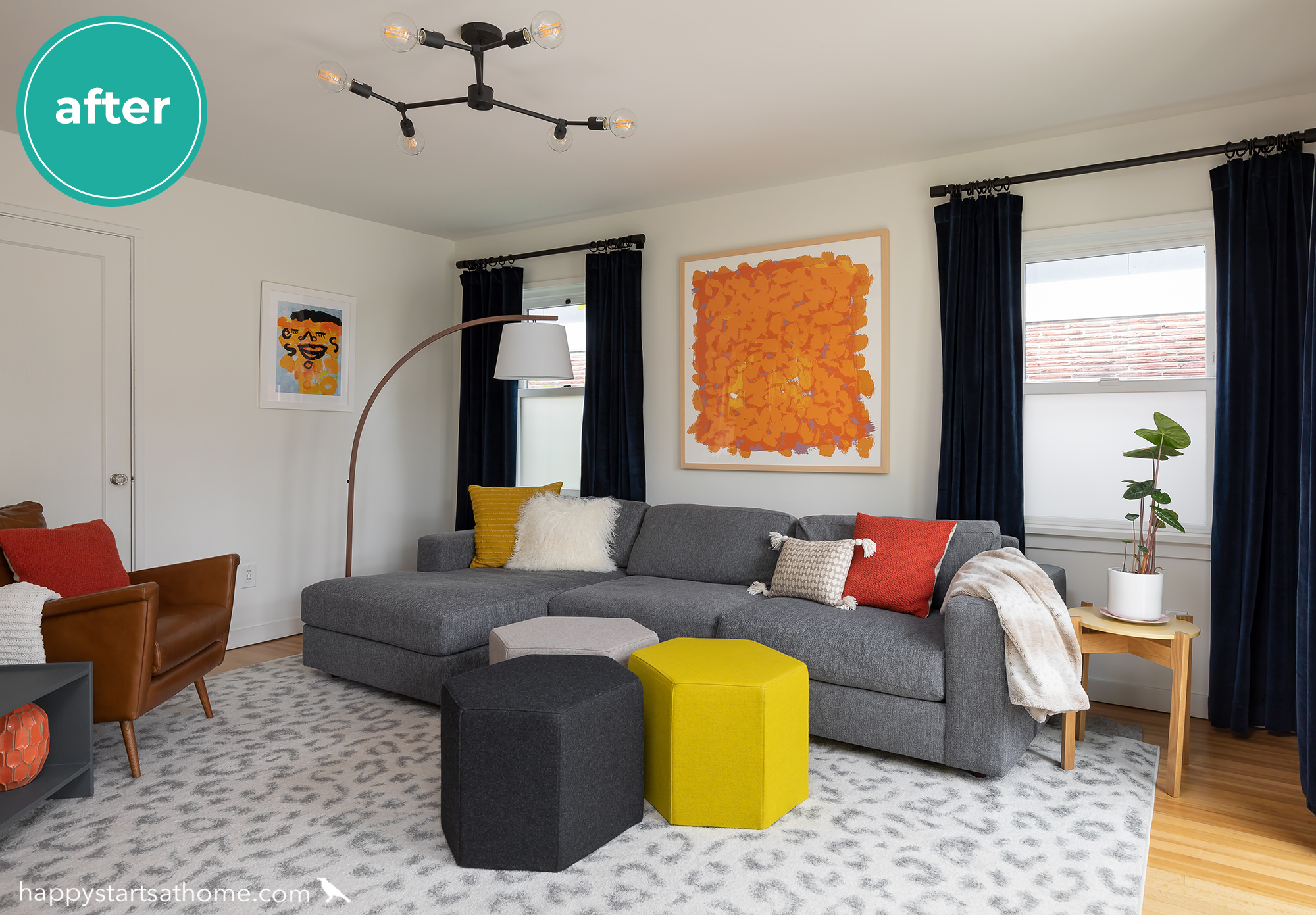
Fabulous Family Room
We actually liked the existing sofa and wall color in this room, but they didn’t align with what the client wanted: a fresher feel, neutral walls, and color in easy-to-change elements. Since *we* aren’t happy unless the client is happy, the yellow walls had to go!
New white walls, a neutral rug, and a grey sofa now create a great foundation for layered color brought in through artwork and accessories, while the deep, rich curtains anchor the room and add gorgeous contrast. The cheetah-print in the rug and branching modern light fixture add in a playful vibe while still feeling sophisticated, and the splashes of color through the artwork, pillows, and other accents make it fun and personal!
Gorgeous Guest Bath
For the last room on the main level, we took the guest bath from bland to brilliant! Bold yellow wallpaper from good ol’ Anthropoligie adds contrast that makes the white beadboard, tile floor, and new shower curtain feel even lighter and brighter, and the modern-style vanity light makes this classic bath feel updated and fun!
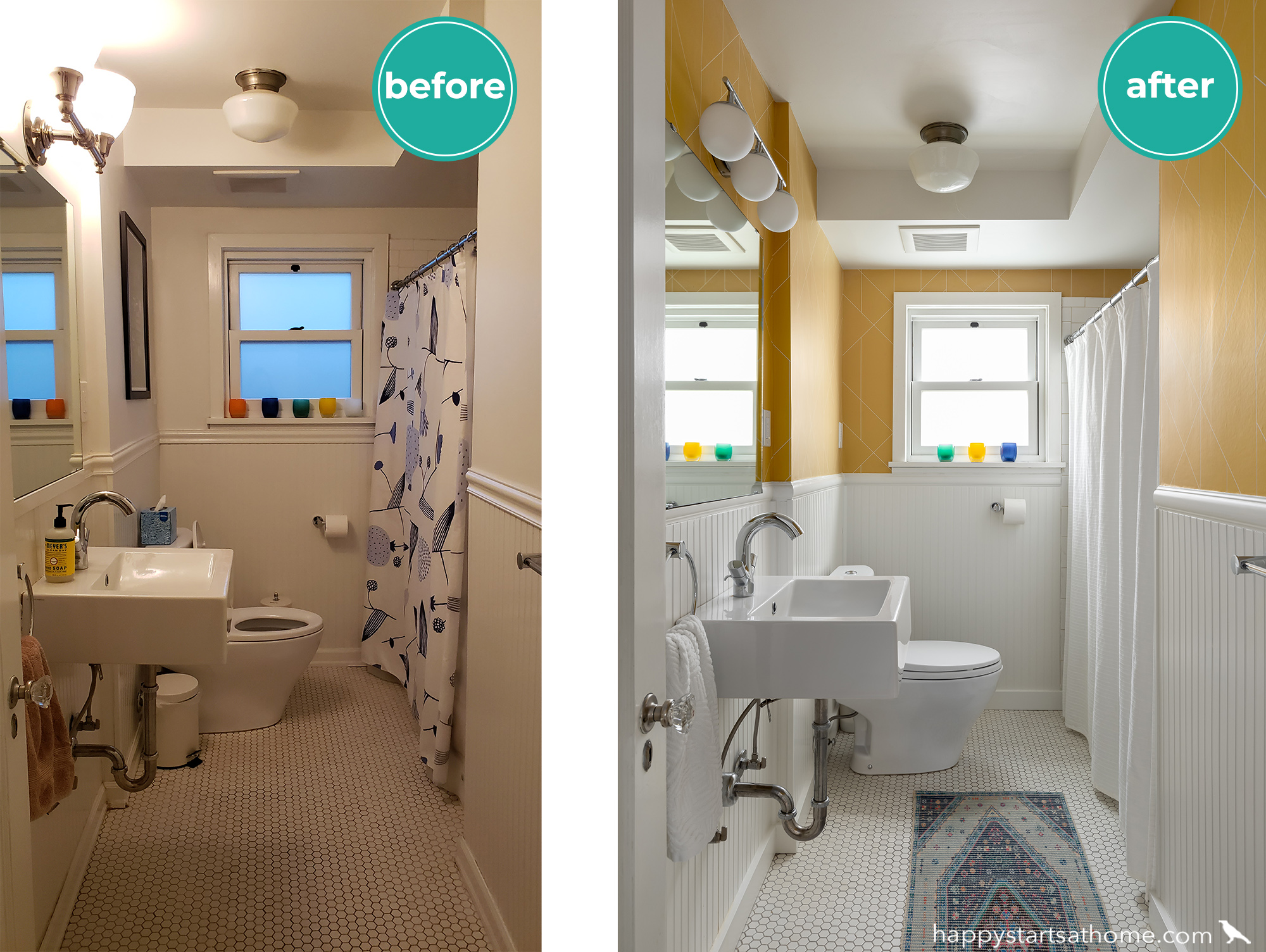
Designer Tip #3: less is often more – in this case we reduced the Glassy Baby collection from five to three, giving everyone a little breathing room so they feel special, and making the window sill look less crowded.
Designer Tip #4: to make a dingy white surface look brighter and fresher, put a dark color next to it for contrast.
Now let’s go upstairs!
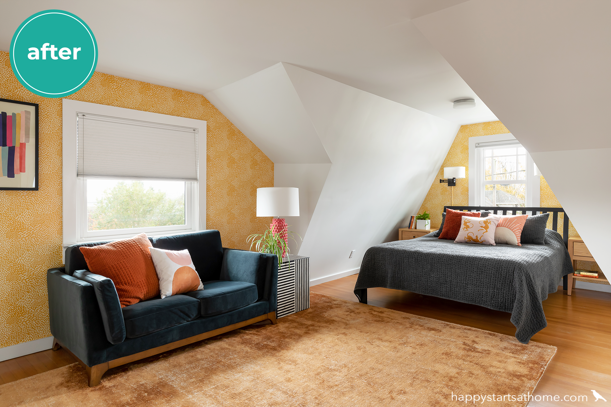
The owner’s suite: bedroom
This attic bedroom was filled with a TON of unrealized potential! It had such cool architecture, but the mid-tone values of the loveseat, rug, bedding and floor made the room feel flat:
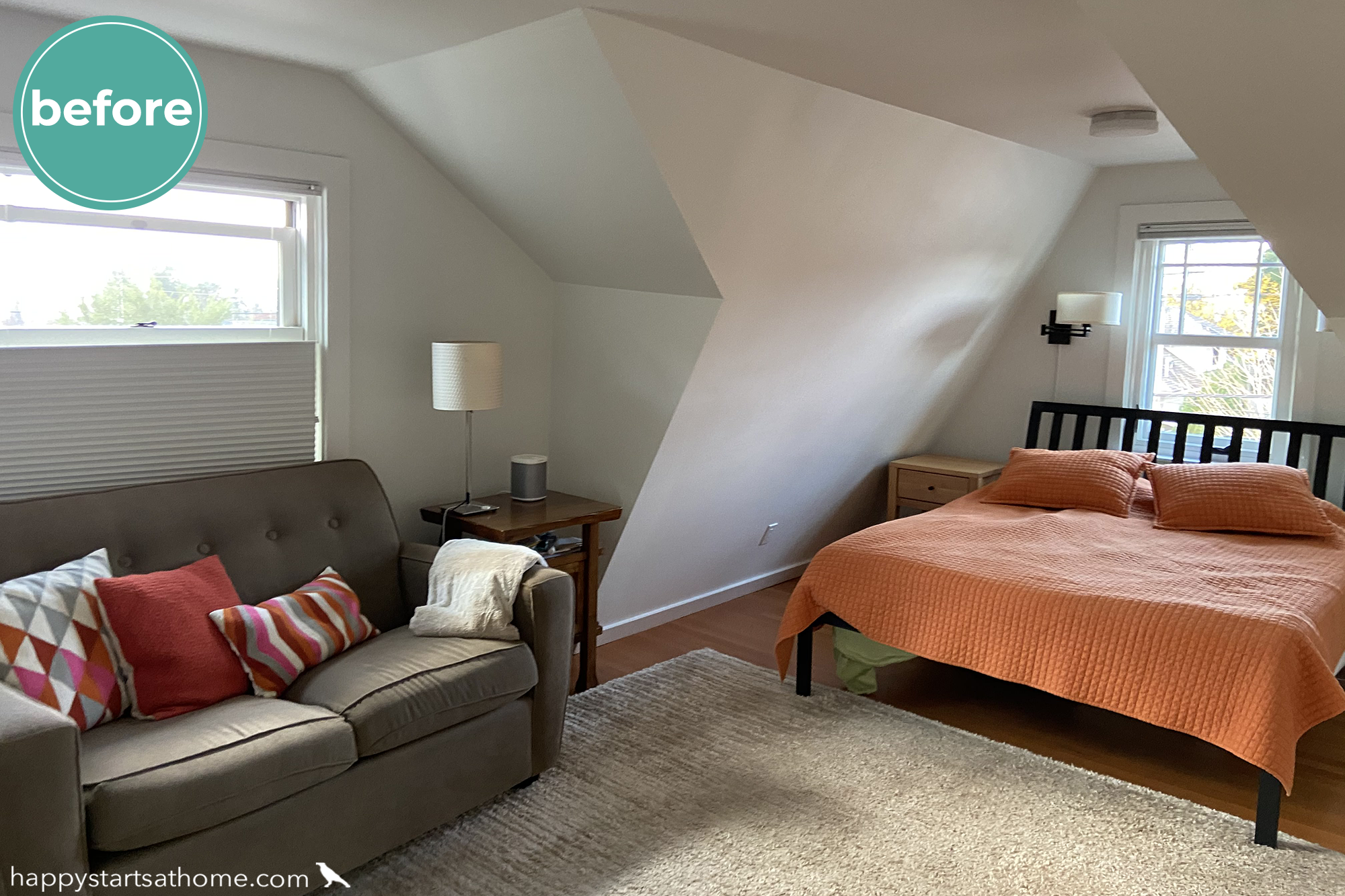
We started this room’s transformation by using wallpaper to show off the architecture of the room. Then we opened up the space with a rust-colored rug (the original beige rug not only chopped up the room visually, it was also an awkward size – “kind of” in the sitting area *and* “kind of” in the bed area). Once the rug tied the room together we could use a deep color on the bedding and the sofa to create distinction between the two spaces and add some calm without worrying about it feeling drab, trusting the oranges and yellows to keep it sunny and bright! All that was left was to layer in personality and whimsy through the throw pillows, art, and lamp! 😀 This is one of my favorite rooms in this happy home!
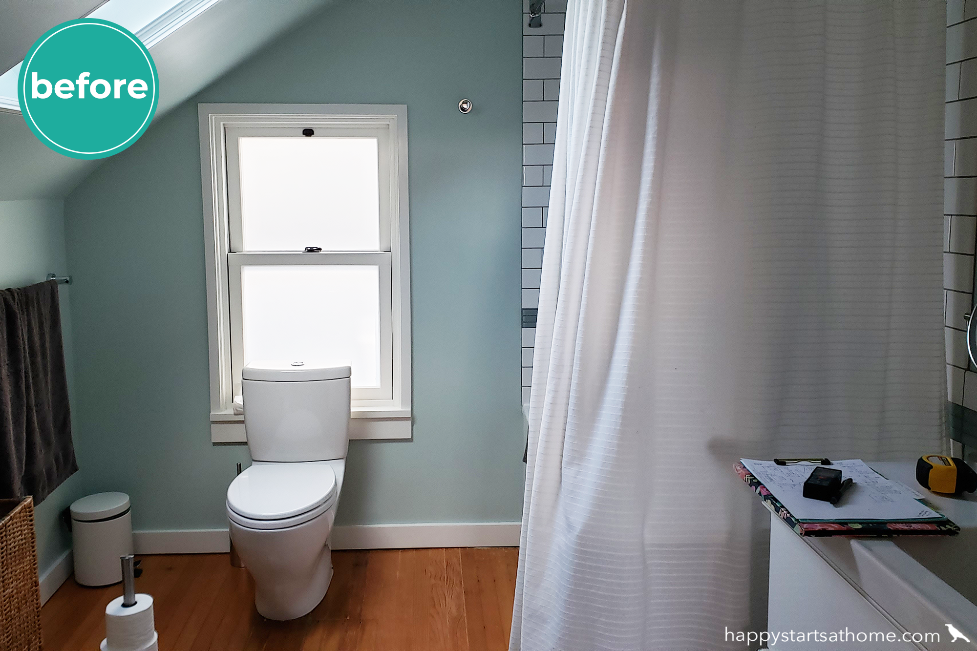
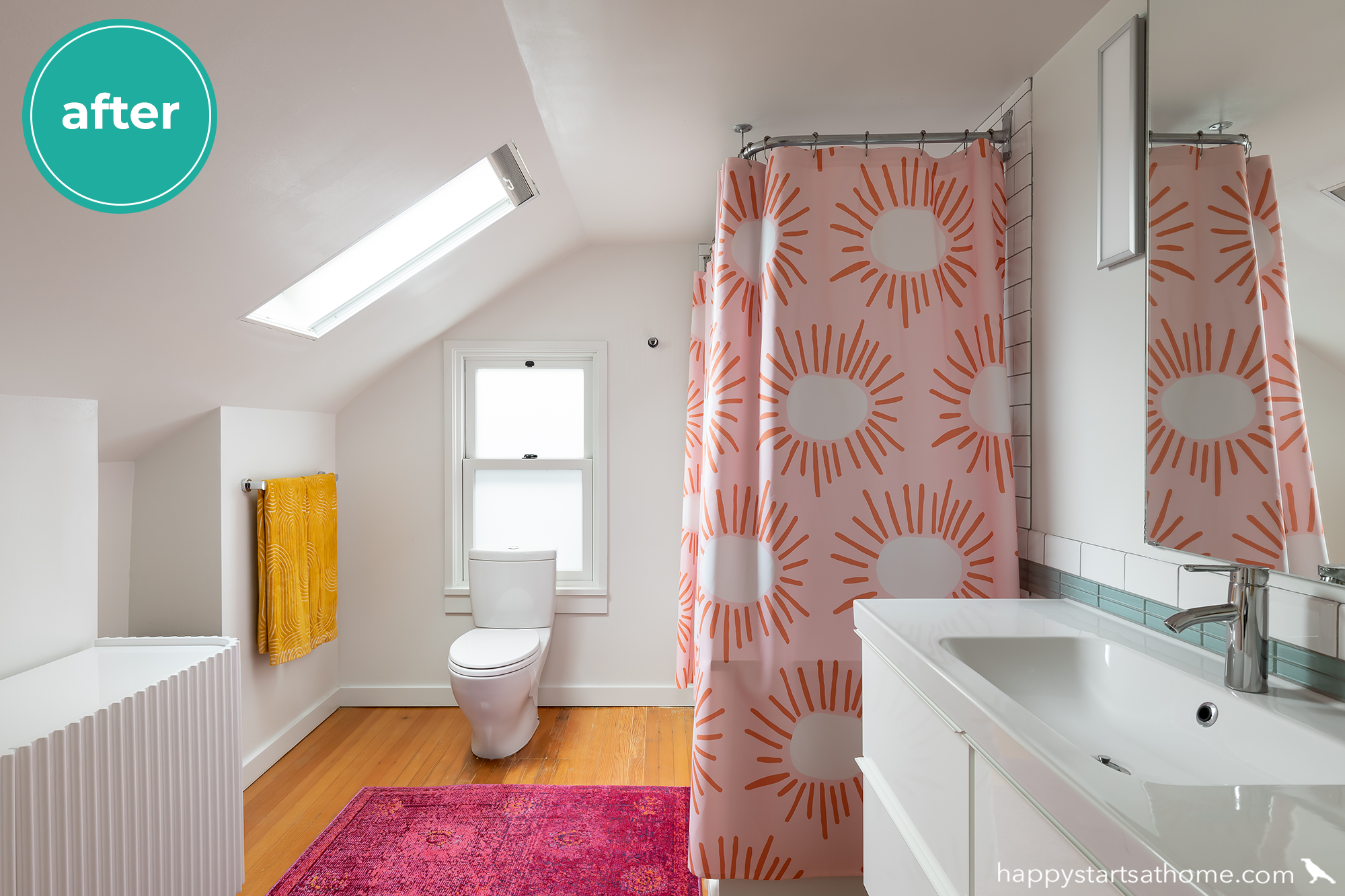
The Owner’s Suite: Bathroom
The adjoining attic bathroom was “fine” with the pretty robin’s egg blue walls setting of the orange fir floors, but the clients wanted it to have a lot more personality and fun!
All it took was a fresh coat of clean, white paint, a fanciful shower curtain by Society6, a delicious hot pink rug and daffodil yellow towels. This is a room with a big ol’ smile on it’s face!
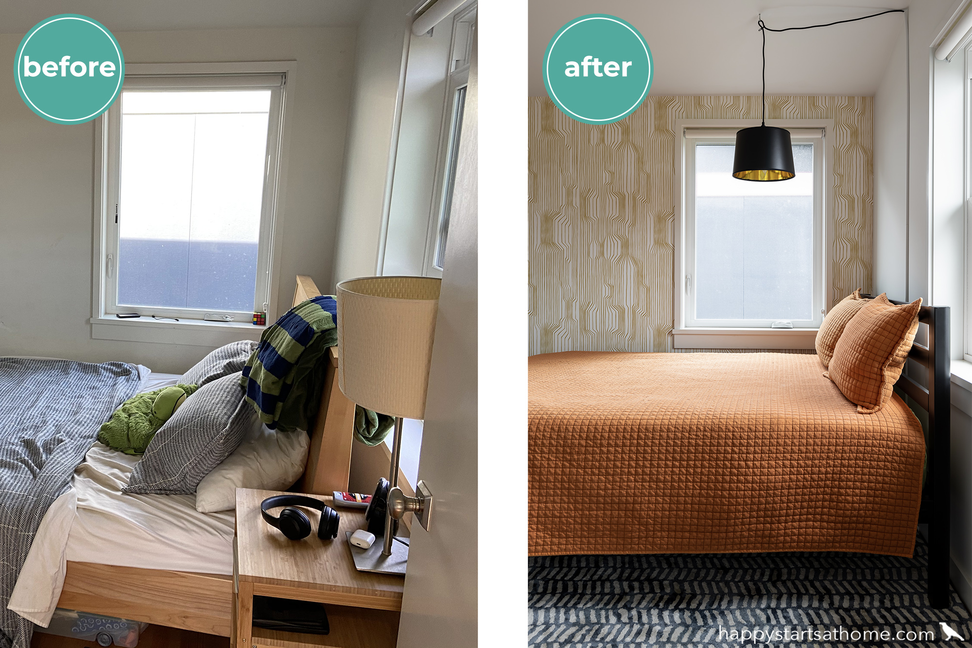
The Kid’s Rooms
Since both kids were in their late teens we wanted to create designs that would suit them and also convert easily to a guest space or home office. And since both rooms were quite cozy, we had to give them personality without making them feel crowded!
In the first room we added a graphic wall paper, repurposed the bedding from the owner’s suite, and laid a graphic rug under the bed. We suspended a gold and black light over the bed, eliminating the need for a side table (since a glass of water or phone could easily sit on the window sill), making the room feel more spacious!
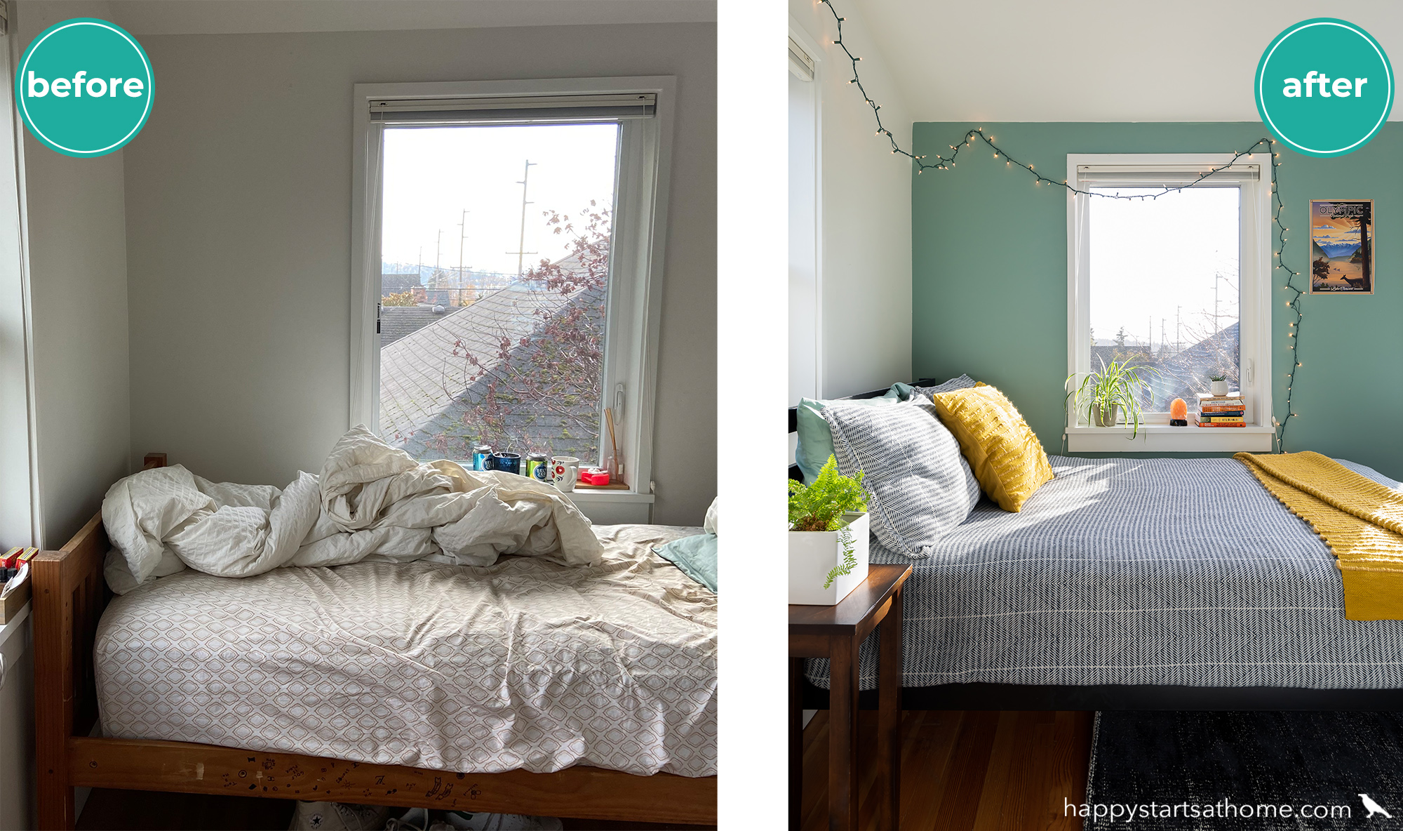
In the second room we kept it simple, painting the back wall in a lovely robin’s egg blue and repurposing the bedding from the first kid’s room. The fairy lights were not in the “official” design plan but we LOVE that the client added them – it’s a perfect way to add personality and a bit of casual whimsy to a room!
The Kids’ Bath
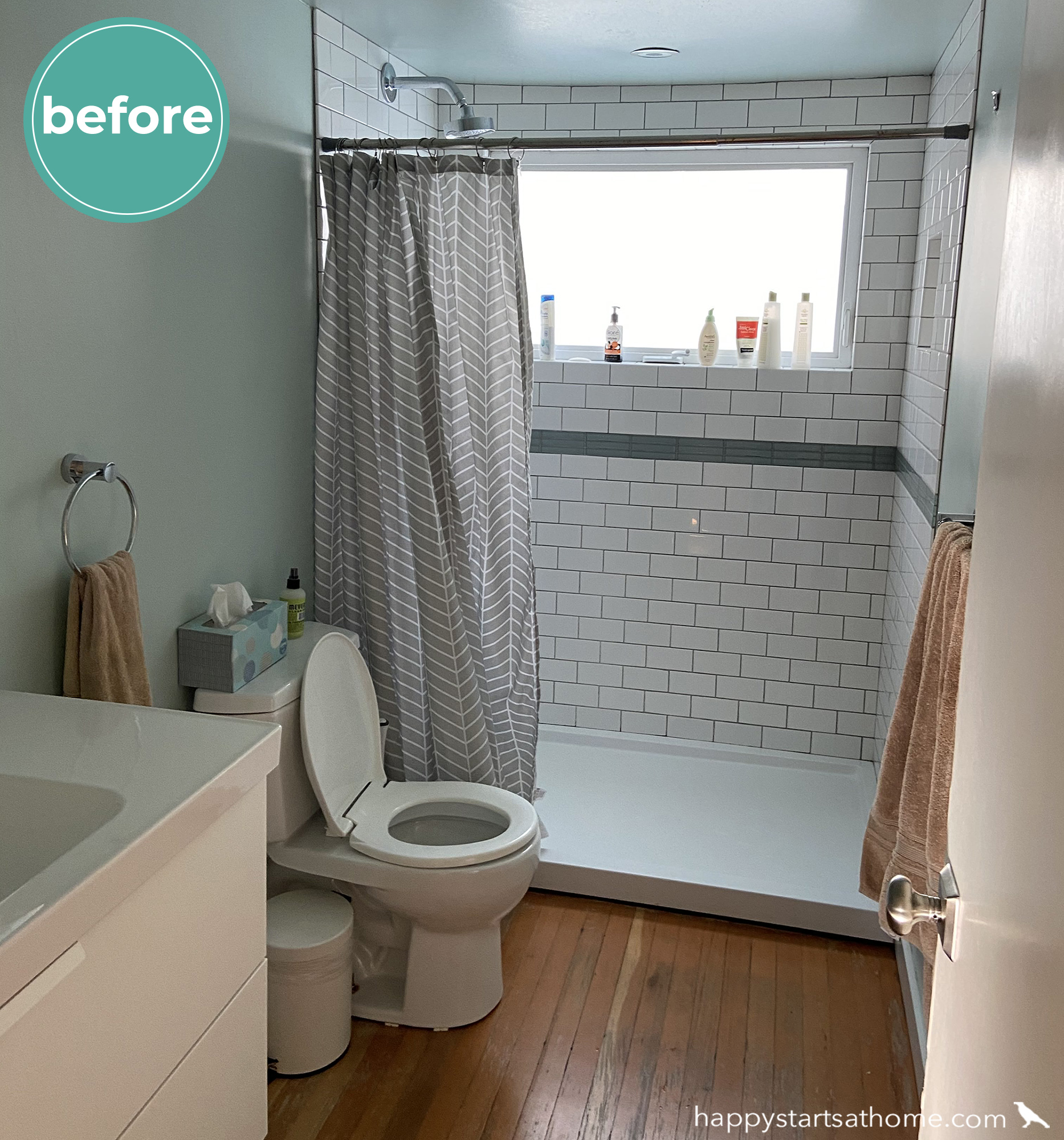
There wasn’t anything wrong with the shared bath, but since it would have felt kind of plain in comparison to the other refreshed rooms, it deserved some love, too. Before, it had robin’s egg blue walls and a gray chevron shower curtain:
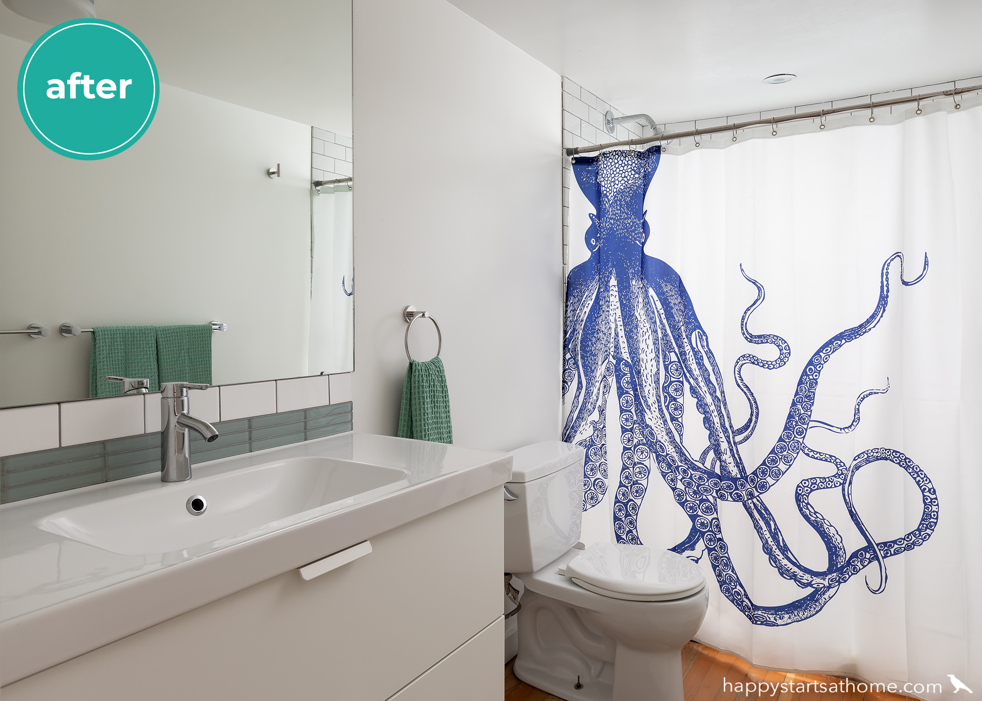
A fresh coat of white paint now shows off the pretty color of the accent tile, and a cobalt blue octopus now greets anyone who enters. 🐙 I love how the daylight makes it all glow!
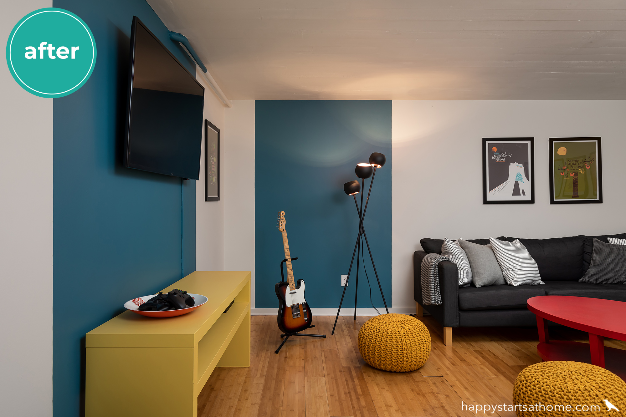
Bonus Room in the Basement
Last but not least, the family had a kid’s hangout room in the basement. It was a little plain, but since soon this house would be an empty nest, they didn’t want to invest too much into the space.
That meant PAINT to the rescue! Two bold blue stripes on the wall brought in much-needed contrast and color, and repainting the console in the same playful yellow paint we’d used on the upstairs fireplace wall added a happy touch. We didn’t have to change their sofa or art, but we did suggest they repaint the Ikea coffee table in a brilliant red, add in a feature lamp to bring in some layered light, and let the guitar be center stage. Not a bad transformation for minimal investment, eh?!
We were so thrilled to be part of this colorful transformation, making sure that the results would be a fabulous reflection of this bold, creative family! My favorite part is that the family already had all these colors in their home. They just needed a guide to help them be bolder about their choices, and we were more than happy to help!
Do you wish *you* had more color in your home? Not sure where to start? Reach out to us when you’re ready and maybe we can help *you* get happy at home, too!
MAY YOUR HOME ALWAYS BE HAPPY!

Are you ready for a seriously happy home?
(Cue the confetti!)

Eager to get happy at home right now?